Matching blush to lipstick sounds simple until the same color looks different on two parts of the face. The lips contribute their own color, the cheeks have a different surface, and the formulas may have different levels of shine and coverage. Exact matching is not always possible or necessary.
Start with the color you most want to wear. If that is a strong lip shade, apply it before deciding how much cheek color you need. If the blush is the main feature, let it establish the direction. Choosing both at full intensity before seeing them together can make the final look busier than you intended.
Look for a relationship you enjoy rather than an identical label. Two muted colors may sit comfortably together even when one is warmer. A sheer cheek color may support a more opaque lip without competing with it. These are options to try, not rules that limit which combinations are allowed.
Change intensity before changing everything
When a pair feels too strong, reduce one of the applications. A familiar lipstick worn lightly can look different beside the same blush. Likewise, a smaller area of cheek color can keep a bright lip as the most noticeable element.
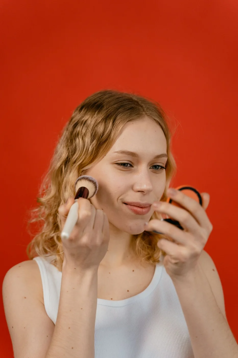
Check the combination in ordinary light with the rest of your face visible. A swatch on a hand removes much of the context. Your clothing and the surrounding light can also influence the impression, so there is little value in demanding that one pairing work identically in every setting.
If you enjoy experimenting, keep a short list of combinations already in your collection. Write the exact products and the amount or finish you liked: a light layer, a softly blended cheek or a more defined lip. The note can help you recreate the look without buying a coordinating set.
Avoid assuming a single multipurpose product is the only way to achieve harmony. Use cosmetics only on the areas their directions permit. Separate products can create a coherent effect and may be easier to apply in the textures you prefer.
The useful test is how the colors look together on you, not whether their shade names suggest the same fruit, flower or season. Packaging names are memorable, but the mirror gives you the more relevant comparison.